Graphic Communication Design (Level 8)

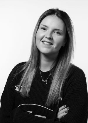
Emma O’Kelly

My Major Project brand ‘Cúpla Focal’ was a café organisation which is based in As Gaeilge, the language of Ireland. This project was designed as a welcoming space where people can relax, socialise with friends and family, and engage with the Irish language through conversations and learning.

This frame from the Secret 7’’ anniversary motion graphics project highlights the organisations focus on community, creativity and mental health support achieved through charitable fundraising. Simplified human like icons and bold colour contrast were used to communicate emotion and inclusivity without relying on identifiable individuals.
This logo combines the letters ‘C’ and ‘F’ into a minimal coffee cup icon while the gradient and rounded corners create a welcoming and approachable identity. The fada incorporated above the logo is a subtle nod to the Irish language, reinforcing the brands bilingual identity while adding visual detail.
This first mock-up demonstrates how the Cúpla Focal identity translates into a real world café environment. The minimal logo and colour palette create a calm and contemporary atmosphere, while the clean typography and subtle gradients reinforce the brands approachable personality.
This coffee cup showcases the Cúpla Focal branding applied to takeaway packaging, displaying the recognisability of the logo across physical products. The muted green and blue palette represents the national colour of Ireland (blue) and the green earth of the country (green). The clean white logo maintains a modern and approachable aesthetic.
This signage mock-up demonstrates the adaptability of the brand identity with urban café settings. The contrast between the dark background and vibrant logo colours enhances visibility and reinforces the brands modern and culturally inspired aesthetic.
This business card mock-up explores the versatility of the Cúpla Focal identity across a range of colour variations and layouts. The combination of soft colour tones, minimalist typography and repeating logo patterns reinforces the brands modern aesthetic.
This is an editorial spread taken from Horsepower, a personal narrative project exploring my journey into motorsport and the experiences that shaped my passion for racing. Inspired by a quote from Sabine Schmitz, the typography was arranged to resemble the form and movement of a racing track, visually reinforcing themes of determination, individuality and progression.
This spread from the same book, Horsepower, uses repeated tyre track patterns and directional lines to visually reference movement, speed and the physical textures associated with motorsport. Embedded within the pattern is the hidden phrase “Shes with Keys”, adding a subtle personal detail as a nod to women in motorsport.
This final spread from Horsepower explores the experience of being a woman in motorsport through layered typography and overlapping comments often directed at female drivers. The chaotic arrangement of phrases reflects the constant noise of stereotypes and criticism, while the statement “Heard it all. I drove anyway.” Reinforces resilience, determination and confidence within a male-dominated space.

Graphic Communication Design